Platforms covered
Ford.com (global + regional)
Vehicle & feature landing pages
Mobile + responsive experiences
Interactive/immersive content
Marketing channels
FordCredit.com
My Role
Project scope
A comprehensive redesign of Ford’s global digital ecosystem — including Ford.com, FordCredit.com, and related platforms — across 120+ markets and five regions. The work focused on unifying design, improving performance, and enabling content scalability.
Player/Coach model
Outdated architecture and fragmented UX across 120+ global markets
Inconsistent branding and interaction patterns between regional sites
Siloed teams and legacy systems slowed delivery and innovation
Limited accessibility and mobile responsiveness across touchpoints
Rising customer demand for immersive, interactive digital experiences
Established a unified design system to drive consistency across 120+ markets
Collaborated across global regions, aligning workflows, tech, and business goals
Balanced speed and scale by designing in Figma and prototyping in parallel with devs
Led iterative reviews with regional teams to adapt designs without sacrificing brand integrity
Integrated accessibility, localization, and platform flexibility into every component

Unified UX and branding across 120+ markets through a scalable global design system
Accelerated delivery by integrating reusable components and dev-aligned workflows
Delivered consistent accessibility, localization, and platform flexibility
Created immersive, award-winning content using VR, AR, CGI, and 360°
Established a player/coach model that scaled team skills and collaboration
Contributed to Ford’s elevated presence across web, social, and emerging platforms
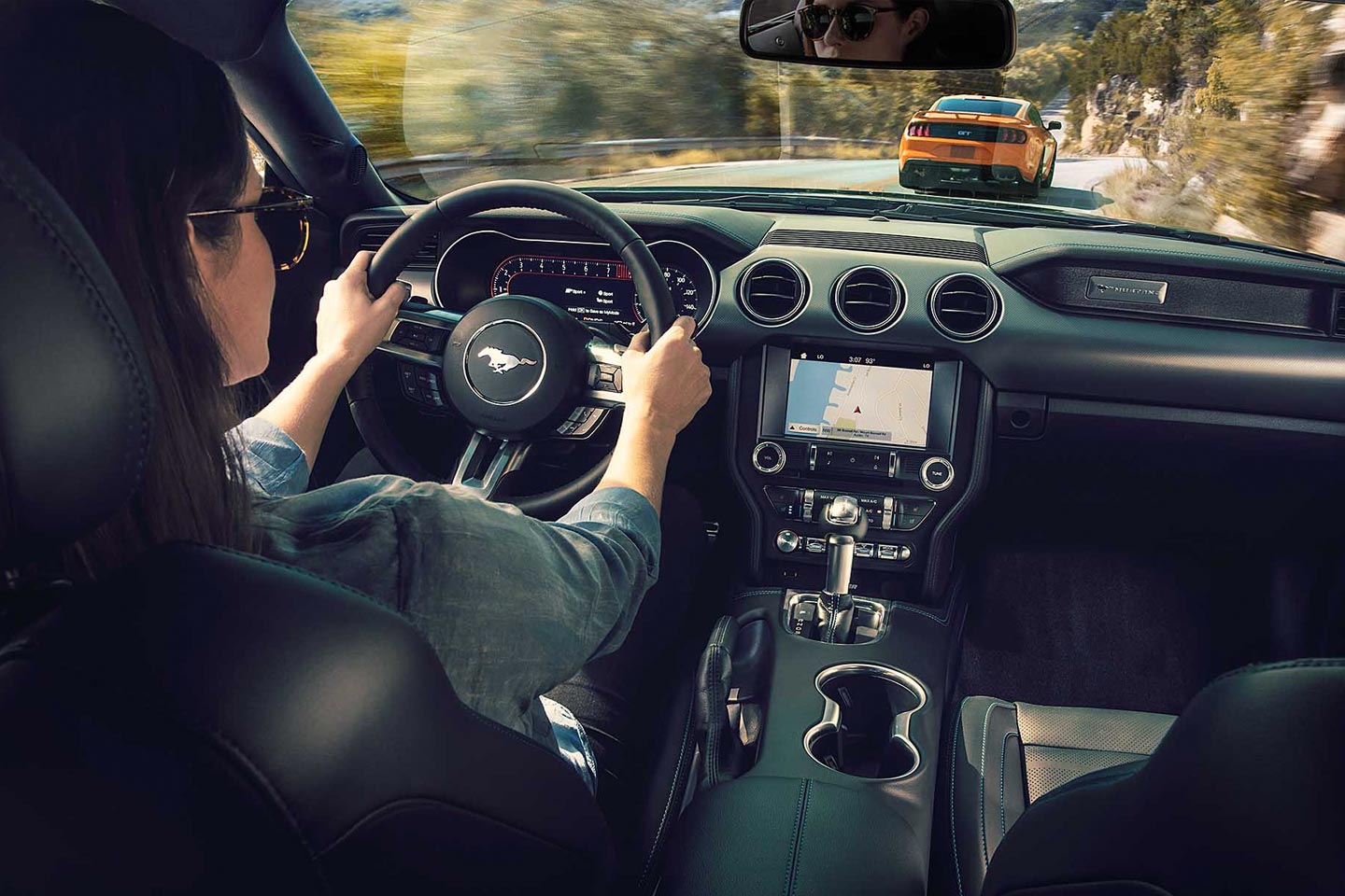
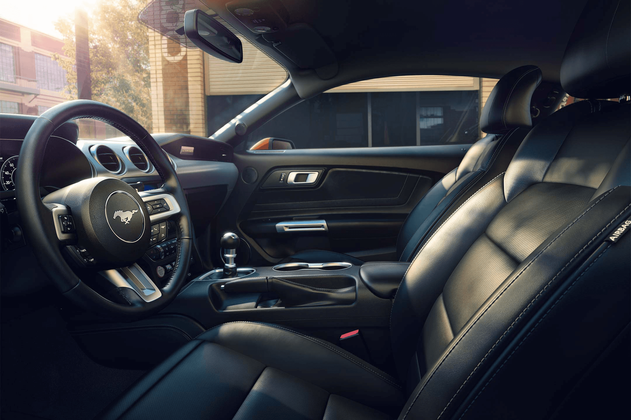
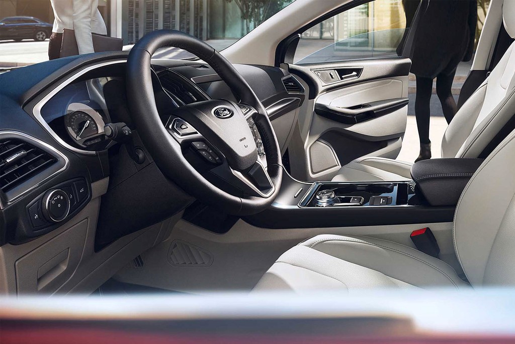
With Ford VR and our 360° Interior Experience, we elevated the digital showroom into an immersive, interactive journey. Accessible across devices — mobile, desktop, and VR — users could explore every detail of a vehicle’s interior with pinpoint accuracy and without downloading an app.
This experience became the most engaged-with feature across vehicle pages and contributed to a significant rise in Build & Price usage and dealership leads. It’s a testament to how thoughtful use of technology can drive both experience and measurable impact.
Designing the tools that turn interest into intent.
I’ve led the design of multiple Ford vehicle configurators, key tools that influence both user experience and purchase decisions.
The goal: deliver a seamless, intuitive interface that handles everything from simple to complex builds — across trims, accessories, and evolving powertrains — while remaining clean, flexible, and responsive across devices.
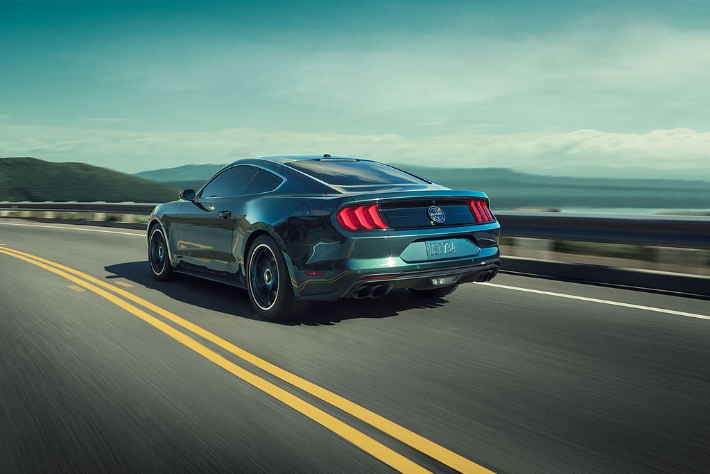
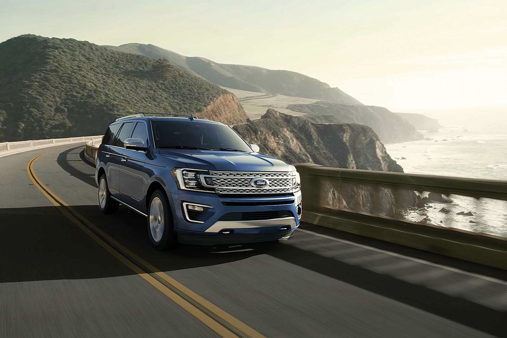
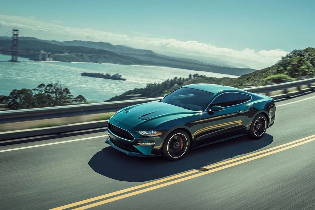
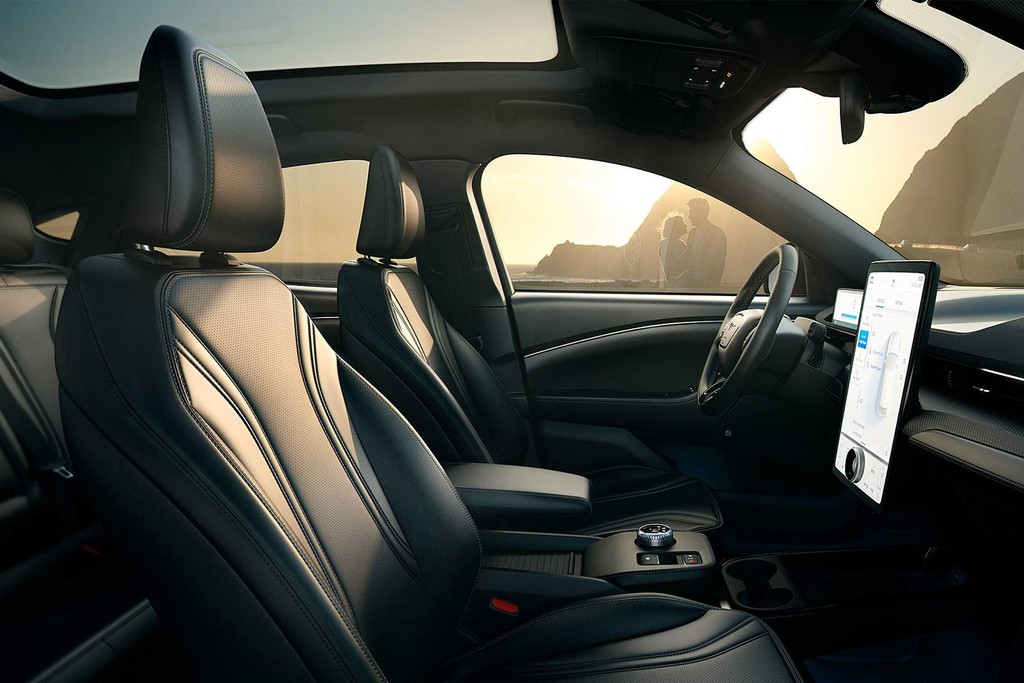
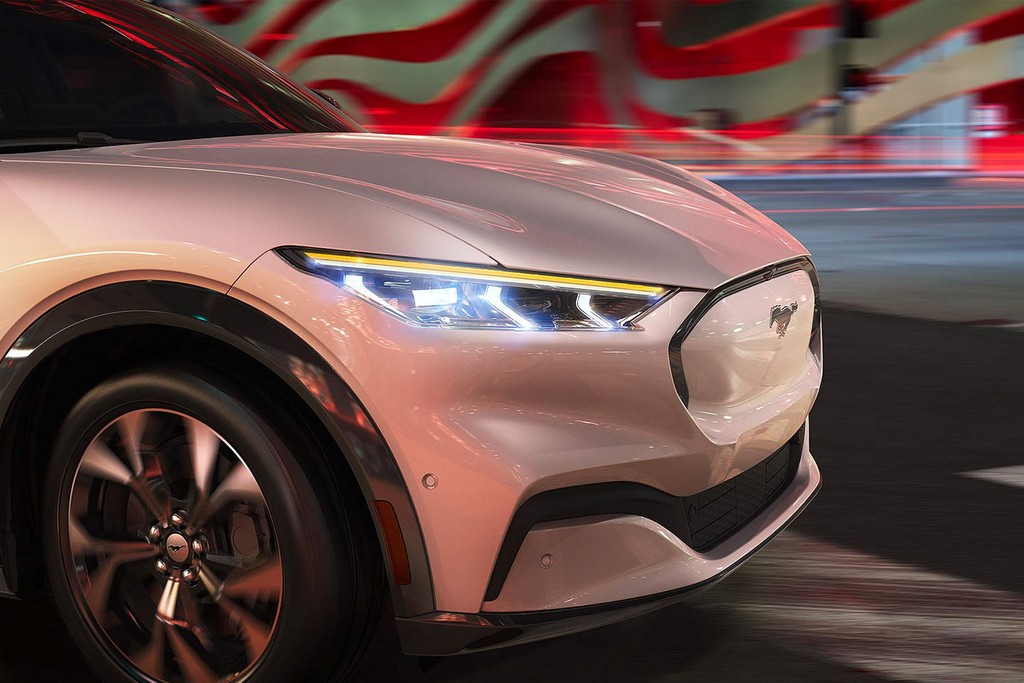
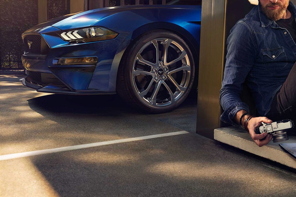
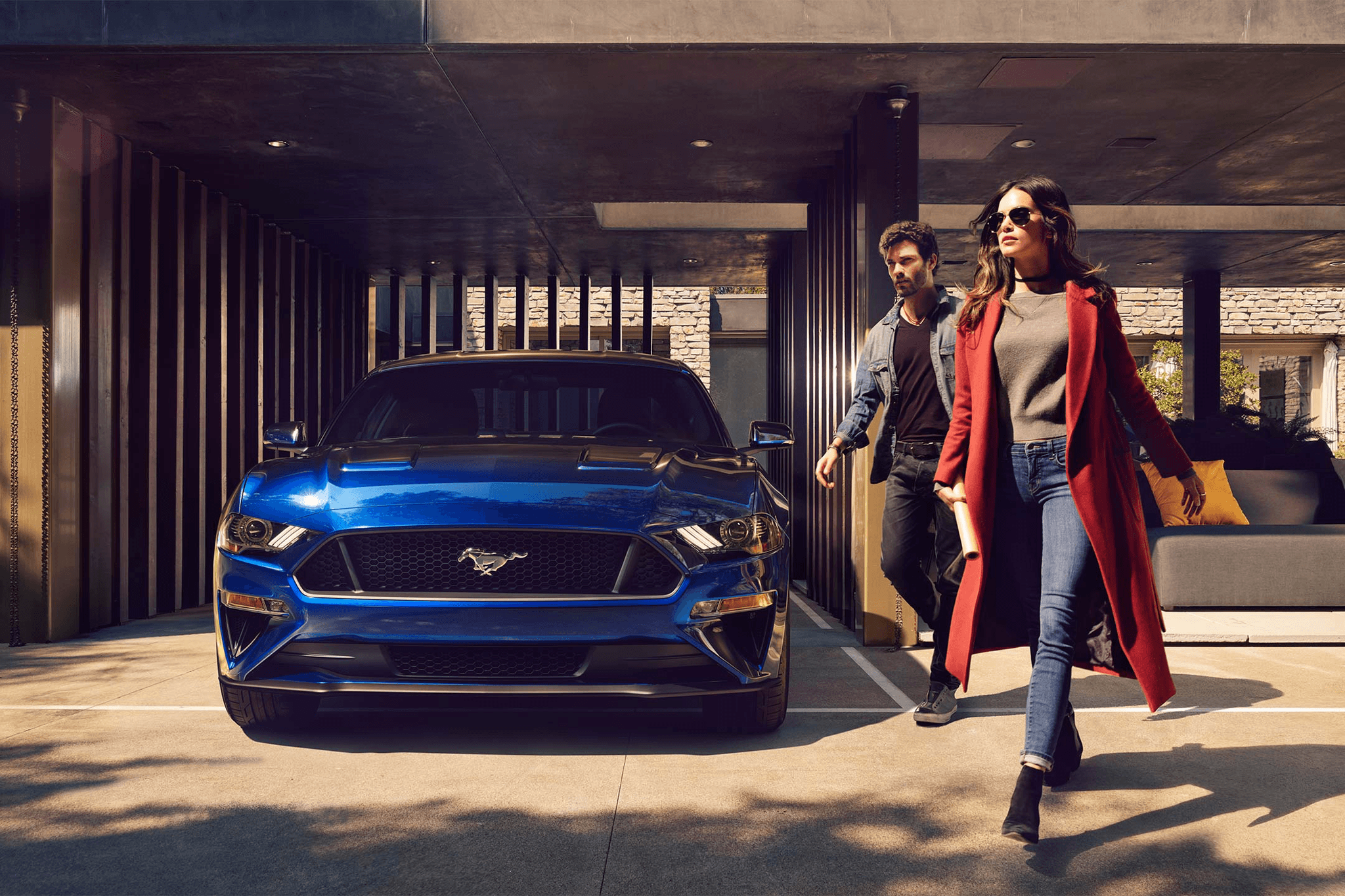
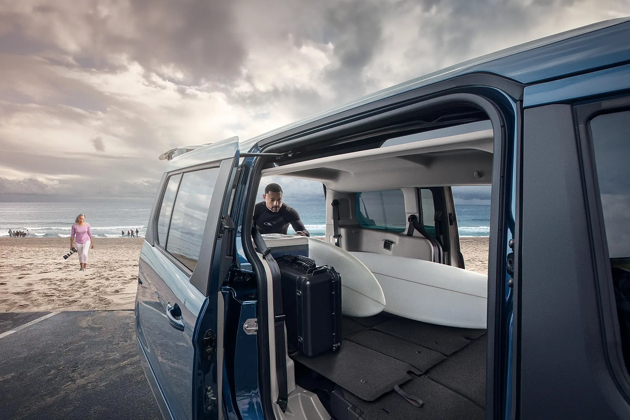
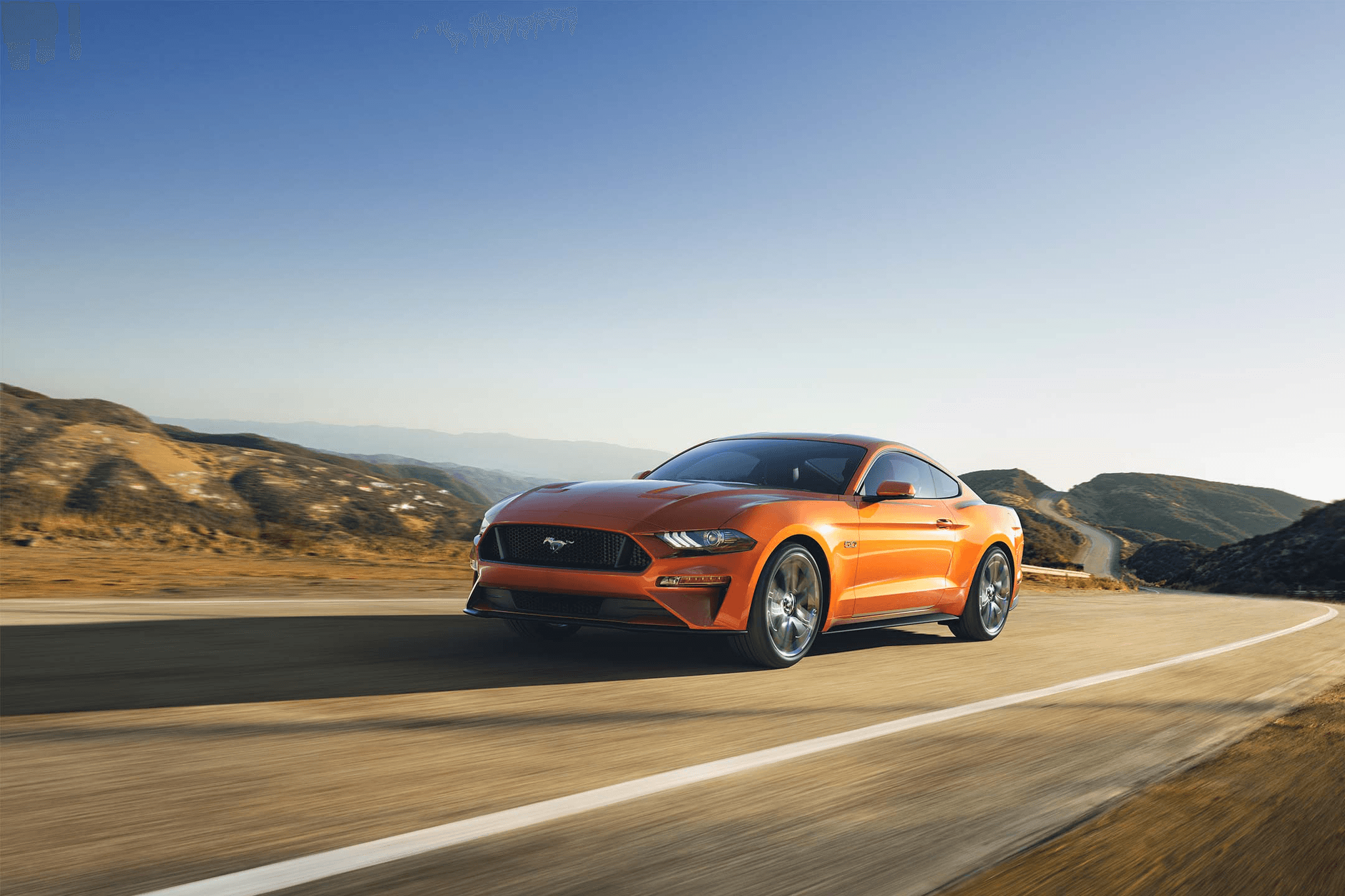
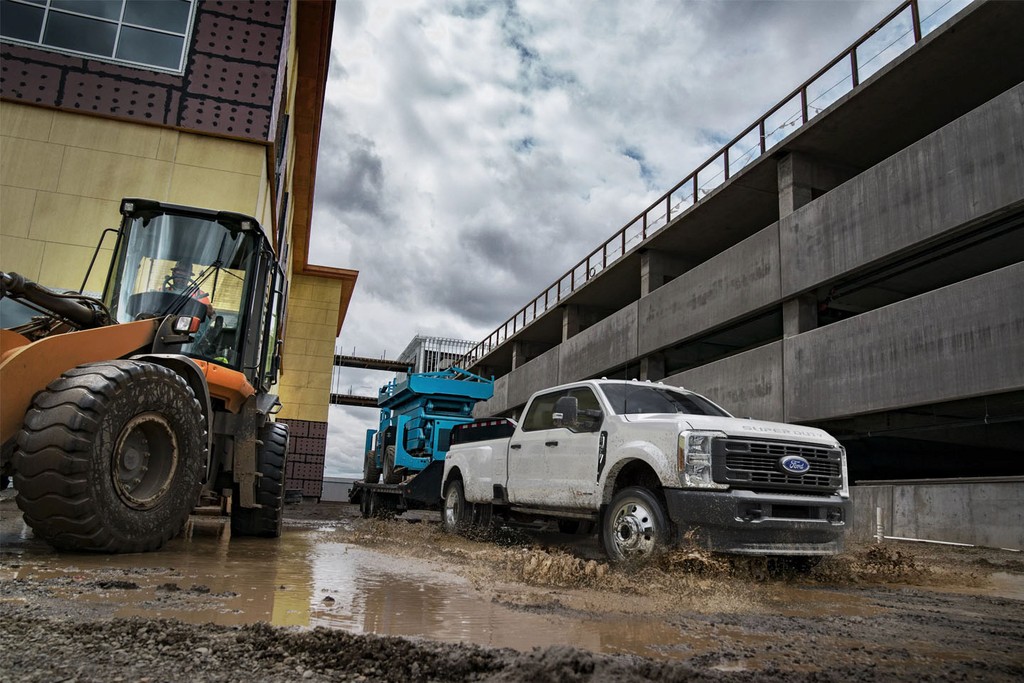
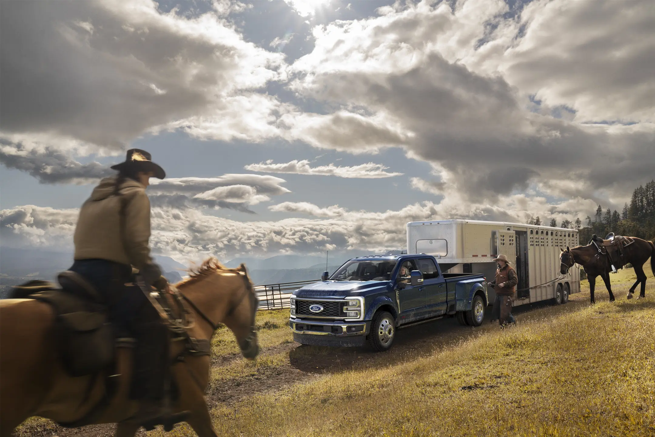
We moved beyond repurposed brand assets to produce original, story-driven content tailored specifically for digital platforms. I led the creation and direction of custom shoots — overseeing everything from location planning to post-production. Each asset was crafted to feel purposeful, align with the brand, and drive engagement.
By collaborating closely with clients and securing dedicated budgets, we elevated both the visual and narrative depth of Ford.com. Every piece of content — whether still, CGI, or motion — was designed to support the vehicle story, enhance the user experience, and deliver measurable business results.
STill Photography
CGI Created Content
I led a year-round team dedicated to creating and refreshing content across hundreds of feature pages. For clients with deep and diverse lineups, this meant staying ahead of routine product updates every 12, 18, or 24 months while maintaining brand clarity and consistency.
Each feature page was built using a flexible system of purpose-designed components, allowing us to quickly select and deploy content elements as needed. This modular structure ensured efficiency, while our creative approach made every page feel fresh, relevant, and aligned to each vehicle’s distinct personality.
Icons are small but mighty, essential for guiding users and creating clarity. Collaborating with a freelance designer, I led the creation of Ford.com’s first comprehensive icon system. The goal was consistency, scalability, and global resonance — a unified visual language that worked seamlessly across platforms and regions.


